
Abstraction for fashion
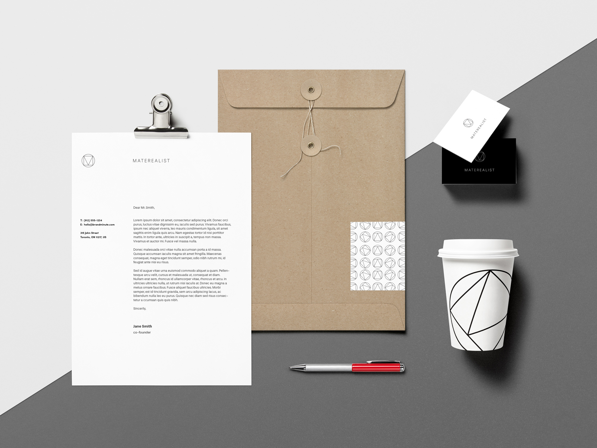
A fashion photographer, specializing in large catalog shoots, came to our team to rebrand and apply that brand to the web. This identity needed to feel at home beside fashion brands, and excite practitioners from those brands to work with them. It needed to be striking, blend with their style of photography, and have flexibility for future application. For the icon we looked at camera schematics, light physics, the golden ratio, editing software displays, and after synthesis and discussion we crafted the final icon utilizing the triangular and square form of the M and the circular enclosure of a lens. After ideation, the site bravely became an expressive single page experience that goes from first point introduction to full comprehension of the brand, preparing the user to reach out with work.
Project
Branding, Web Design, Icon Design
Role
Designer / pb+j


Little bit of flavour


